source: http://onlinestatbook.com/chapter4/pearson.html
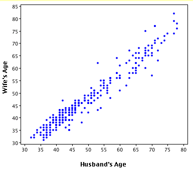
A scatter plot displays data on a Cartesian graph as dots (each with a specific x and y value). Depending on how the dot distribution pans out, there may be a pattern that the reader can discern either linearly, exponentially, etc. In the graph above, the age of the partners in a marriage are represented. Generally speaking, the age of the husband is approximately the same as the wife.
No comments:
Post a Comment